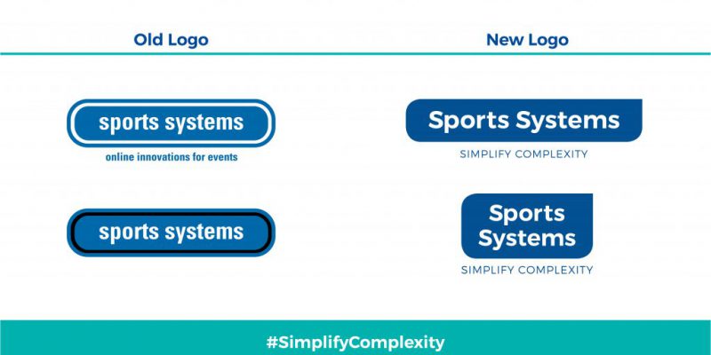
The next time you receive an email from us, see a post on our social media pages, or browse the internet for our name, you will begin to notice a slight, but significant change for Sports Systems: our new, modernized and simplified logo.
With a goal of striving to simplify complexity of sponsorship and sports events management for our clients, we’ve worked hard to live that philosophy for more than three decades. We are constantly driven to think outside the box, be the early adopters of the latest and most efficient technologies, and move the industry forward. We were so busy simplifying things for others that we didn’t think to reflect our passion in our appearance.
It’s not too late. In fact, the timing is just perfect!
This will be one of several new positive changes that you will witness in the days to come.
The logo transformation is subtle, but significant. We kept our recognizable shade of blue and the legacy of the old logo, but added a simplifying touch that will unmistakably imprint our brand in people’s minds. We want to remain recognizable, and, at the same time, emanate the maturity, authority and the stability that Sports Systems has established over the past few decades.
Our new logo is modern and vibrant, with a minimalistic touch that shows our ability to follow trends and change with time– the best of both worlds: tradition and experience combined with cutting edge technology and youthful energy.